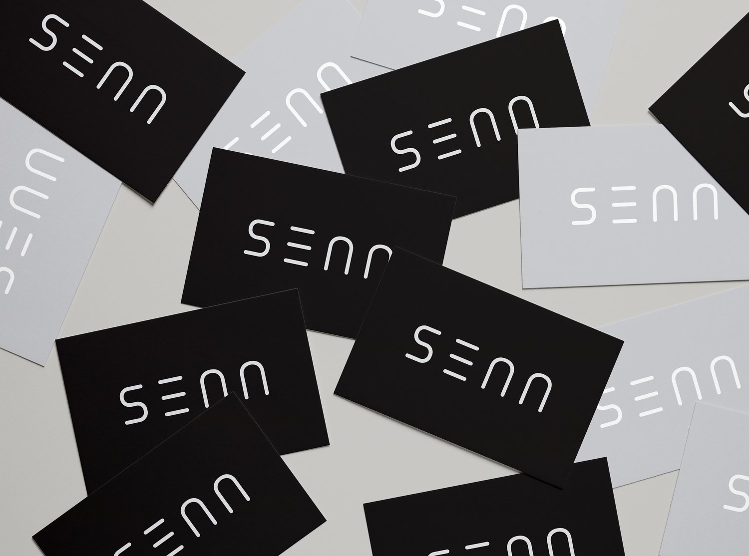
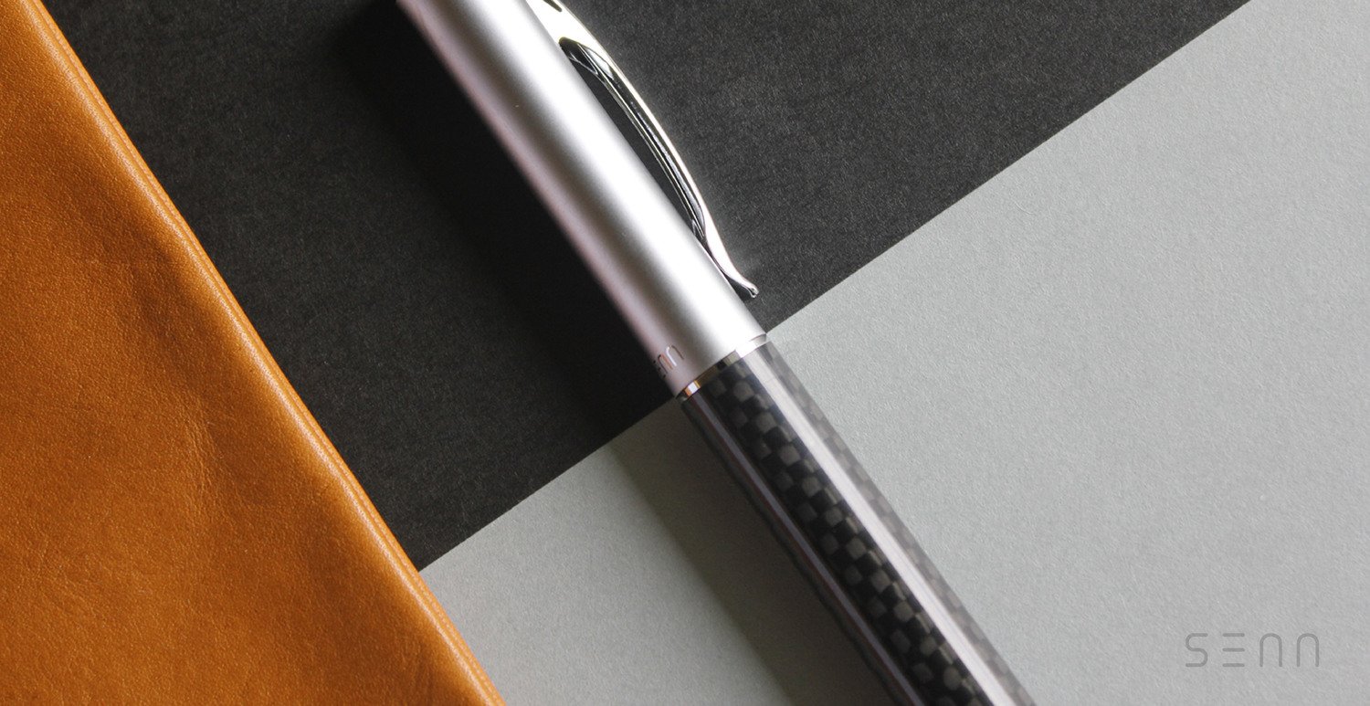
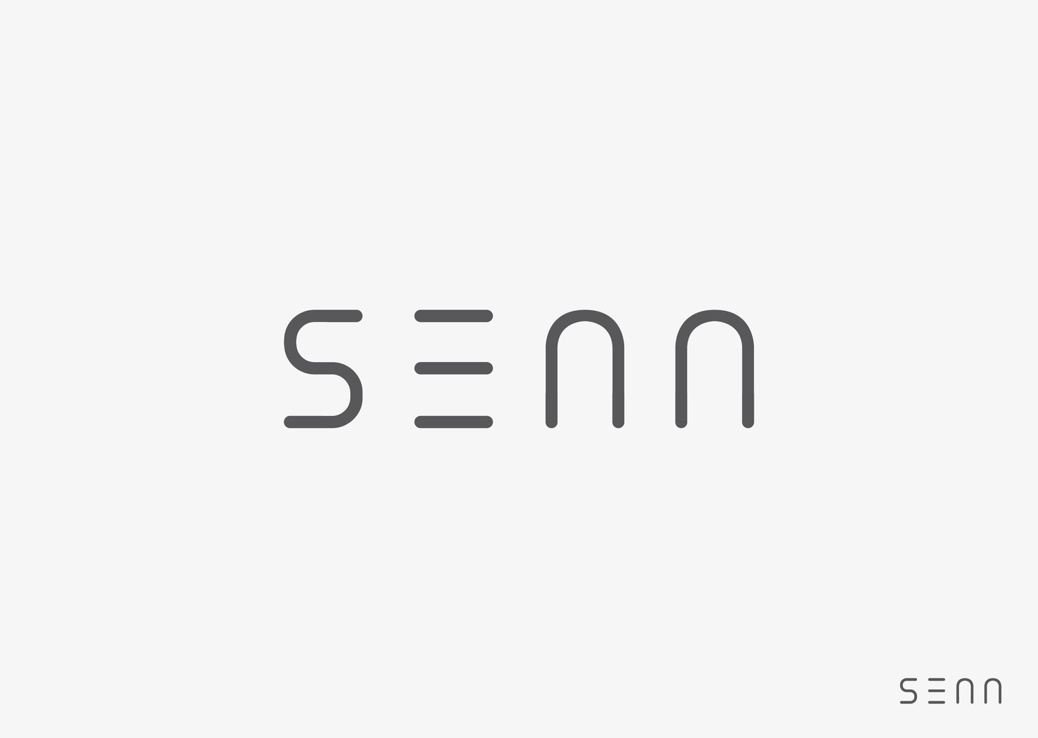

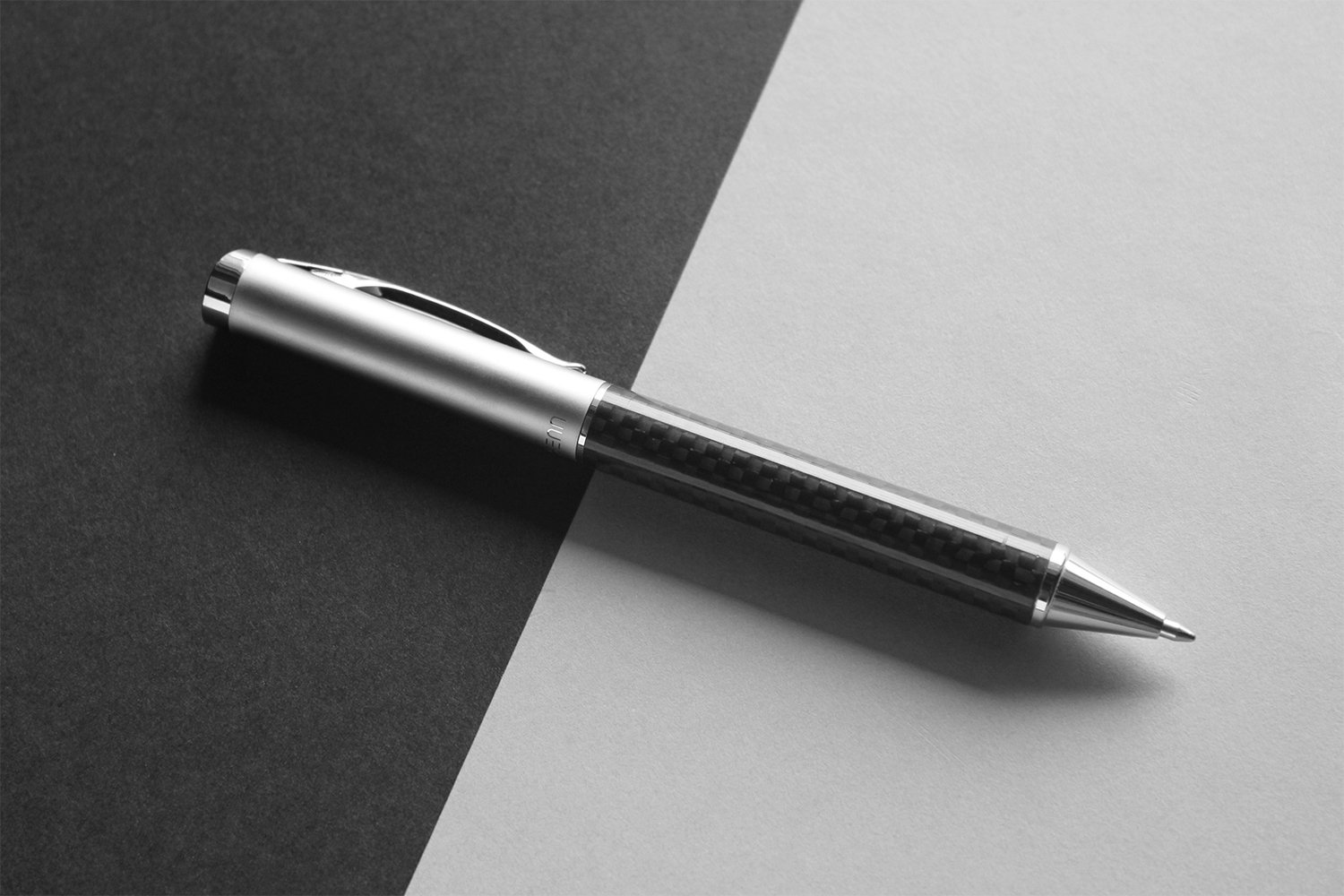
Objective: A logo redesign for SENN in order to create a sleek and minimal look and feel.
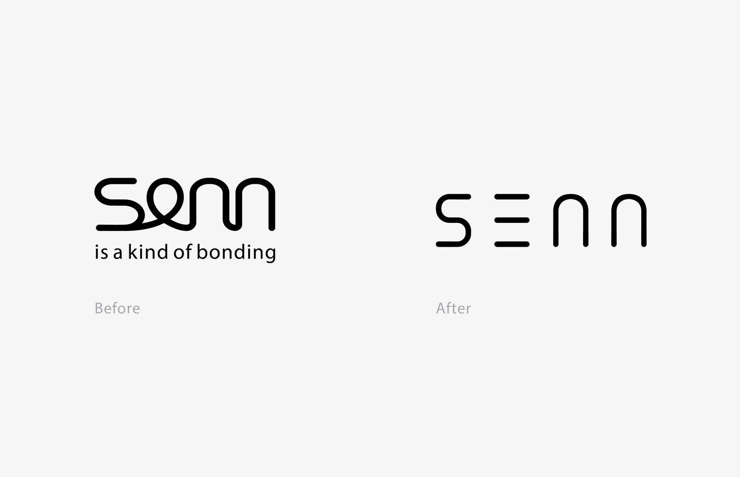
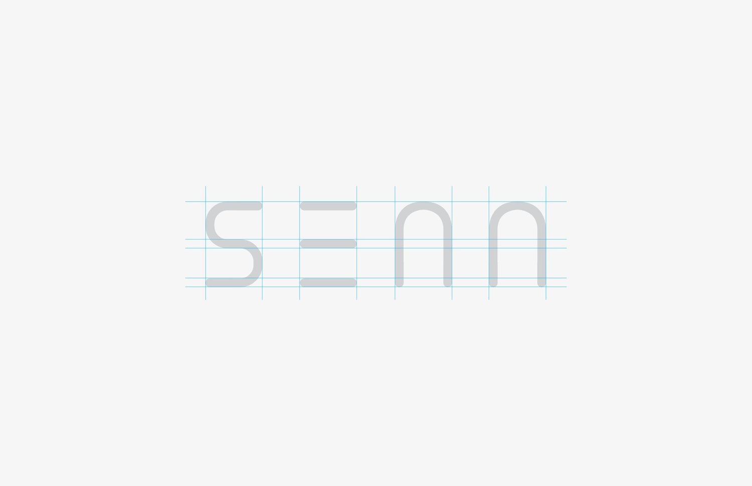
Concept: In Japanese, "SENN" means "line (線)" and that implies the relationship between a pen and a line. The exisiting SENN logo has all the letters connected in one line, yet it affects the legibility. The new logo has the letters separated, creating a clean and minimal style by using simple lines to capture the essence of simplicity.
All Rights Reserved by Wah Fook Holdings Ltd.